UI/UX Mistakes That Lower Conversions
Home > UI/UX Mistakes That Lower Conversions
Home > UI/UX Mistakes That Lower Conversions

When your website gets traffic but struggles to convert, the issue often lies in your design. Common UI UX mistakes that lower conversions can quietly stop users from taking action. A few small UI or UX mistakes can quietly harm your conversion rates. This blog breaks down the most common mistakes and explains how you can fix them to improve your results.
Design is not just about making things look good. It shapes how users feel, move, and decide. A well-designed interface reduces friction, builds trust and guides users toward taking action. Poor design can undo all your marketing work in seconds.
As highlighted in an article on Gravity Global, issues like slow loading times, confusing navigation and poor mobile design often cause visitors to leave before converting.
Why it hurts: Every second counts. Even a short delay can increase bounce rates and hurt your Google rankings.
How to fix it:
Compress and optimize your images using modern formats like WebP
Minify CSS and JavaScript files
Enable caching plugins on WordPress such as WP Rocket or W3 Total Cache
Use a CDN for faster delivery
Test your site regularly with PageSpeed Insights
You can also check our blog on Cloud Strategy to learn how cloud optimization improves site performance.
Why it hurts: Most users browse and buy through mobile devices. If your website does not adapt properly, you lose potential customers.
How to fix it:
Use responsive design so layouts adjust to screen sizes
Keep navigation simple and buttons large enough to tap
Test across multiple devices
Avoid popups that block mobile content
Why it hurts: If users cannot find what they need quickly, they leave.
How to fix it:
Keep your main menu short and clear
Add breadcrumb navigation
Use logical page hierarchy
Test navigation using real user feedback
For deeper insights on optimizing digital workflows, see our post on n8n Automation.
Why it hurts: Too many options overwhelm visitors and slow decision-making.
How to fix it:
Highlight your best or most popular offerings
Use a “Recommended” label for clarity
Guide users step by step instead of showing everything at once
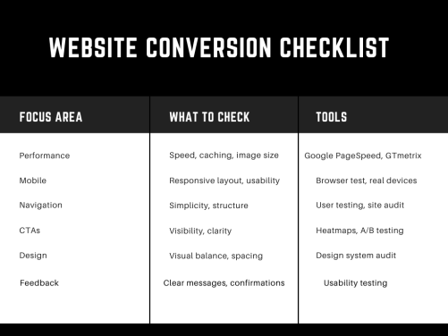
Before wrapping up, let’s make sure your website design actually converts.
Review this checklist to identify UI and UX design issues affecting conversions before launching or updating your website.
Why it hurts: If users cannot see or understand your CTA, they will not click.
How to fix it:
Use bold and contrasting colors
Keep text clear and action-focused (like “Start Free Trial” or “Get a Demo”)
Place CTAs strategically above the fold and near key sections
Avoid generic terms like “Submit”
You can read our blog on Agentic AI to see how powerful CTAs can drive engagement in automation tools.
Why it hurts: Long or unclear forms frustrate users and cause drop-offs.
How to fix it:
Keep only essential fields
Show clear error messages
Enable autofill where possible
Offer guest checkout
Use progress bars for multi-step forms
Why it hurts: A cluttered page confuses users. They lose track of what matters most.
How to fix it:
Use whitespace to give focus
Stick to a consistent color and font scheme
Make important sections visually stronger through contrast and size
Why it hurts: Inconsistency makes users re-learn how to navigate each page, increasing confusion.
How to fix it:
Build a design system and follow it
Use the same button styles, spacing, and alignment across pages
Keep navigation and visuals consistent

Why it hurts: If users take an action and see no response, they lose trust.
How to fix it:
Show progress indicators or confirmation messages
Make error messages specific and easy to understand
Give users options to retry or contact support
Why it hurts: Guessing what users want often leads to poor design decisions.
How to fix it:
Run usability tests with real users
Review heatmaps and click maps using tools like Hotjar
Track behavior analytics in Google Analytics
Keep improving based on data
At Macromodule Technologies, we help businesses turn website metrics into real growth.
Proven Results: We boost traffic, engagement, and conversions through data-driven strategies.
Tailored Solutions: Every website gets a custom plan built around its goals.
Ongoing Support: We track, refine, and optimize for lasting performance.
Work with us to turn insights into impact.
Email: consultant@macromodule.com
WhatsApp: +1 321 364 6867
Visit: https://macromodule.com/


What is AI Powered Workflow Automation in Enterprises AI automation refers to…

What Blockchain for Enterprises Means Digital transformation is forcing organizations to rethink…

Understanding AI Companies In today’s digital-first world, businesses are increasingly relying on…

Understanding Blockchain Security Enterprises today manage massive amounts of sensitive data. Blockchain…

Understanding AI vs Traditional Automation Businesses have relied on automation for years…

Understanding Enterprise Blockchain for Enterprises Enterprise blockchain refers to blockchain systems built…
